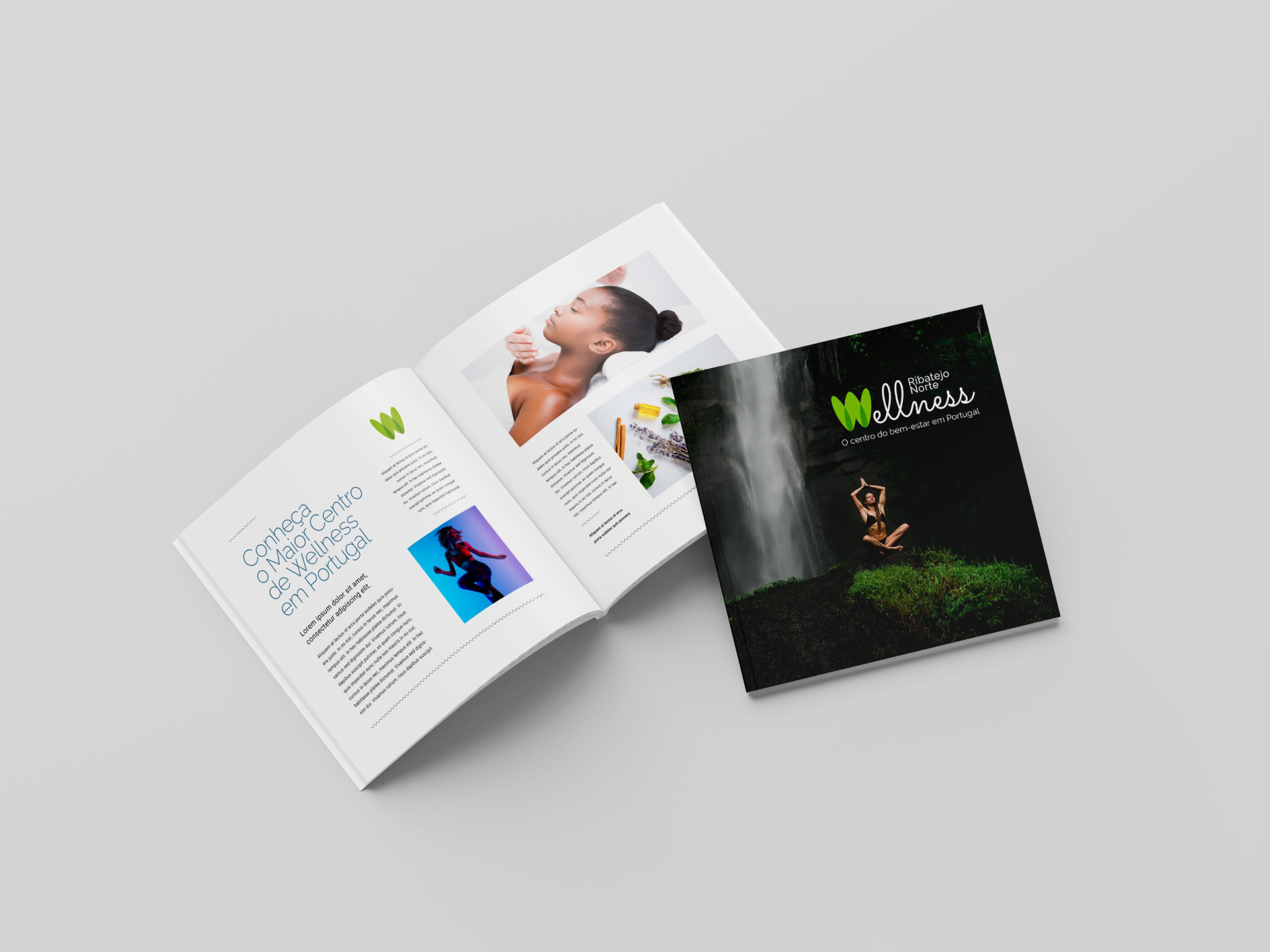
Typography choices, minimalistic and elegant, further reinforce the balanced harmony between nature and modernity. Meanwhile, additional visual assets, such as fluid patterns and soft gradients, echo the gentle flow of water and the unspoiled beauty of the region, emphasizing the restorative experiences the brand promises.
This cohesive design strategy not only communicates Ribatejo Norte Wellness as a sanctuary for relaxation and renewal but also positions the brand as a sophisticated and authentic destination for those seeking to reconnect with nature and themselves.
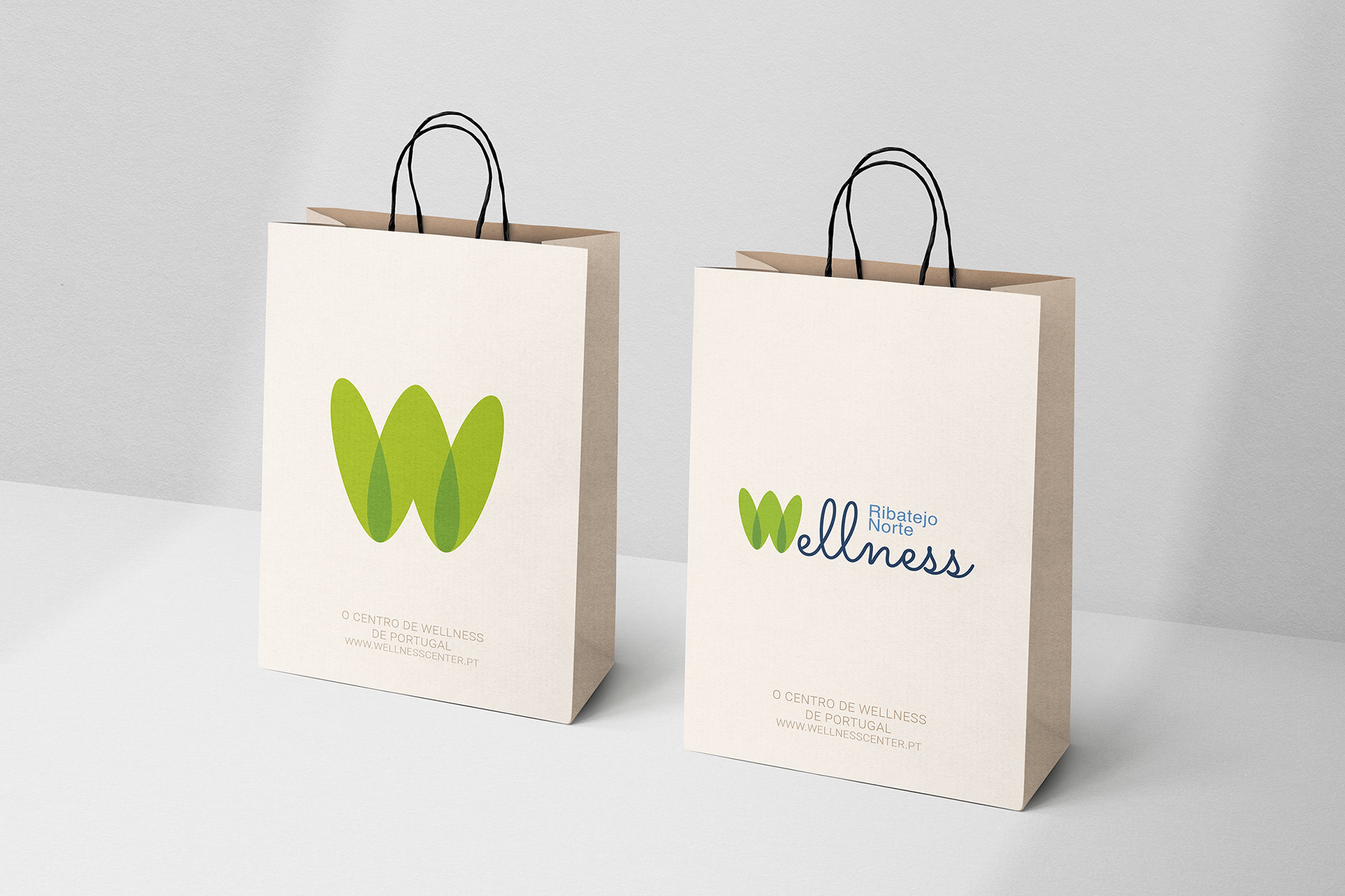
The logo, a centerpiece of the design, combines organic shapes with a palette of earthy tones, reflecting the lush, natural landscapes and peaceful ambiance of Ribatejo Norte. These elements evoke the calm of its serene rivers, rolling hills, and rejuvenating retreats. At the same time, the sleek and contemporary design elements provide a modern edge, ensuring the brand feels both timeless and relevant in a competitive wellness market.